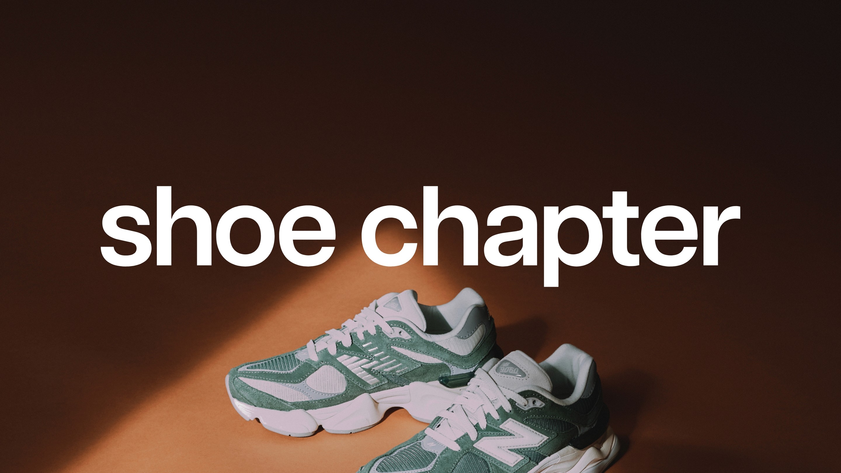
A new chapter for an established sneaker store.
Modernising Shoe Chapter with a cleaner identity and flexible visual system designed around sneakers, culture and ecommerce.

A new chapter for an established sneaker store.
After years in the sneaker scene, Shoe Chapter wanted to update its identity with something cleaner, more contemporary, and better suited to where the store was heading.
The goal wasn't to reinvent the brand. It was to simplify it.
Stripping it back.
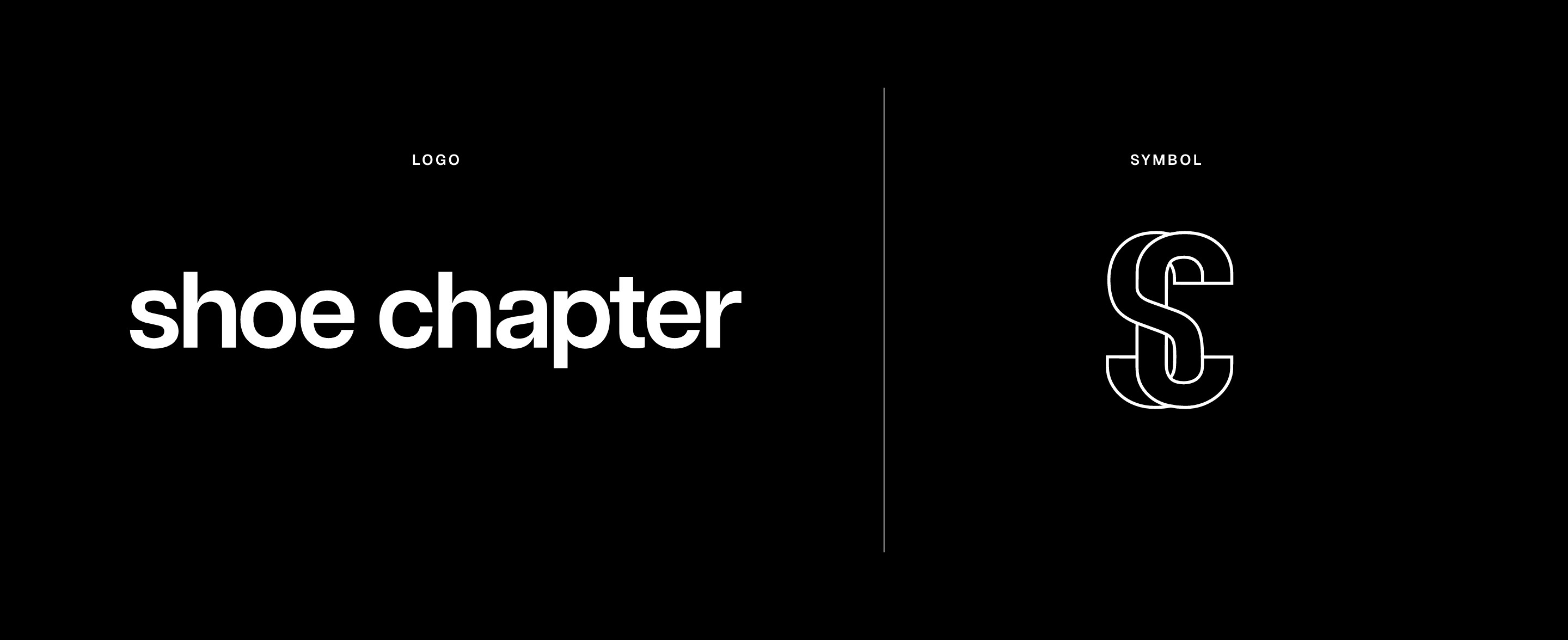
The new identity centered on a simple typographic wordmark, removing unnecessary elements and giving Shoe Chapter a more confident, contemporary presence.
Articulat was chosen for its clean, condensed character, creating a wordmark that feels bold without competing with the products and brands surrounding it.
The identity was designed to work just as naturally on a storefront or label as it does within a digital ecommerce experience.
A flexible visual language.
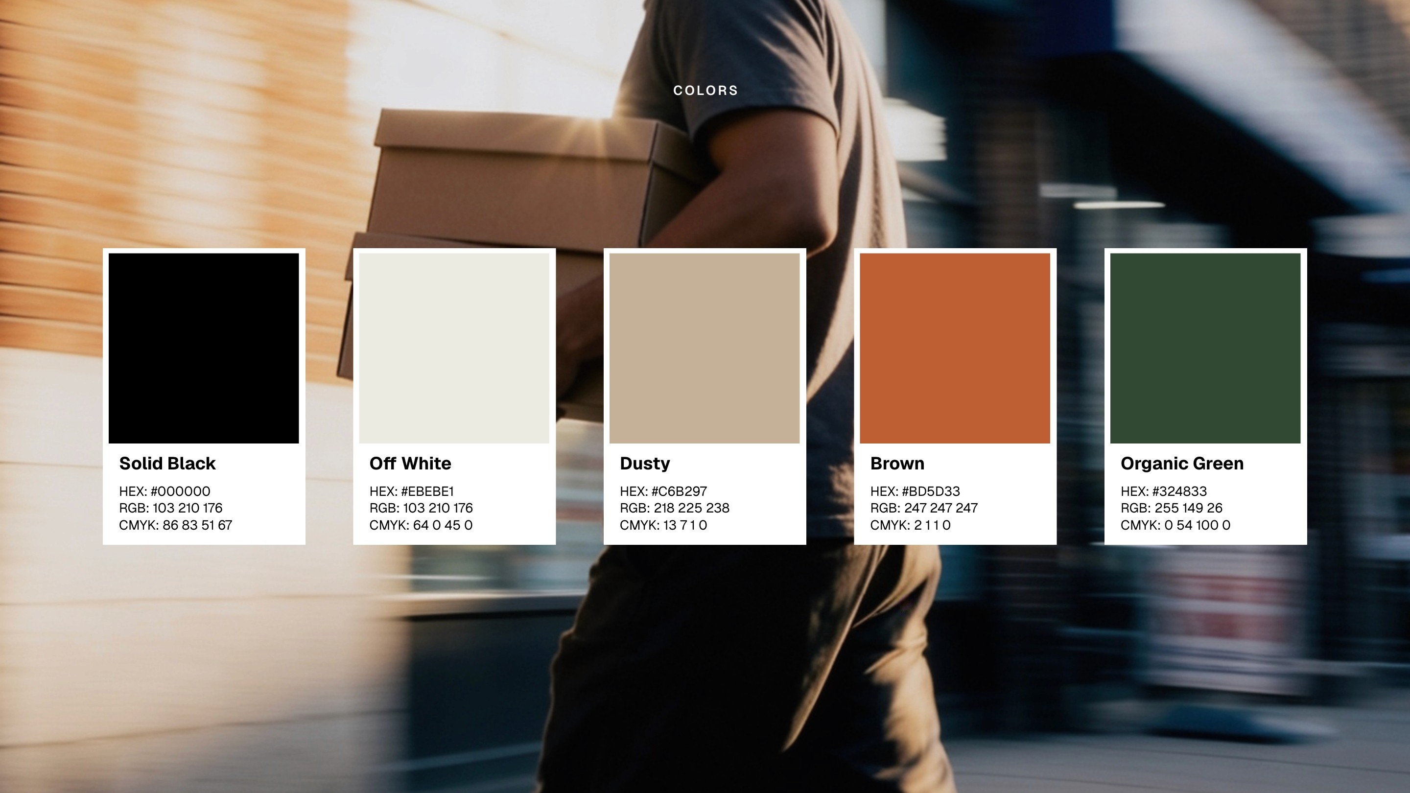
The wider identity pairs the simplicity of the wordmark with a restrained, earthy colour palette of black, off-white, brown, orange and deep green.
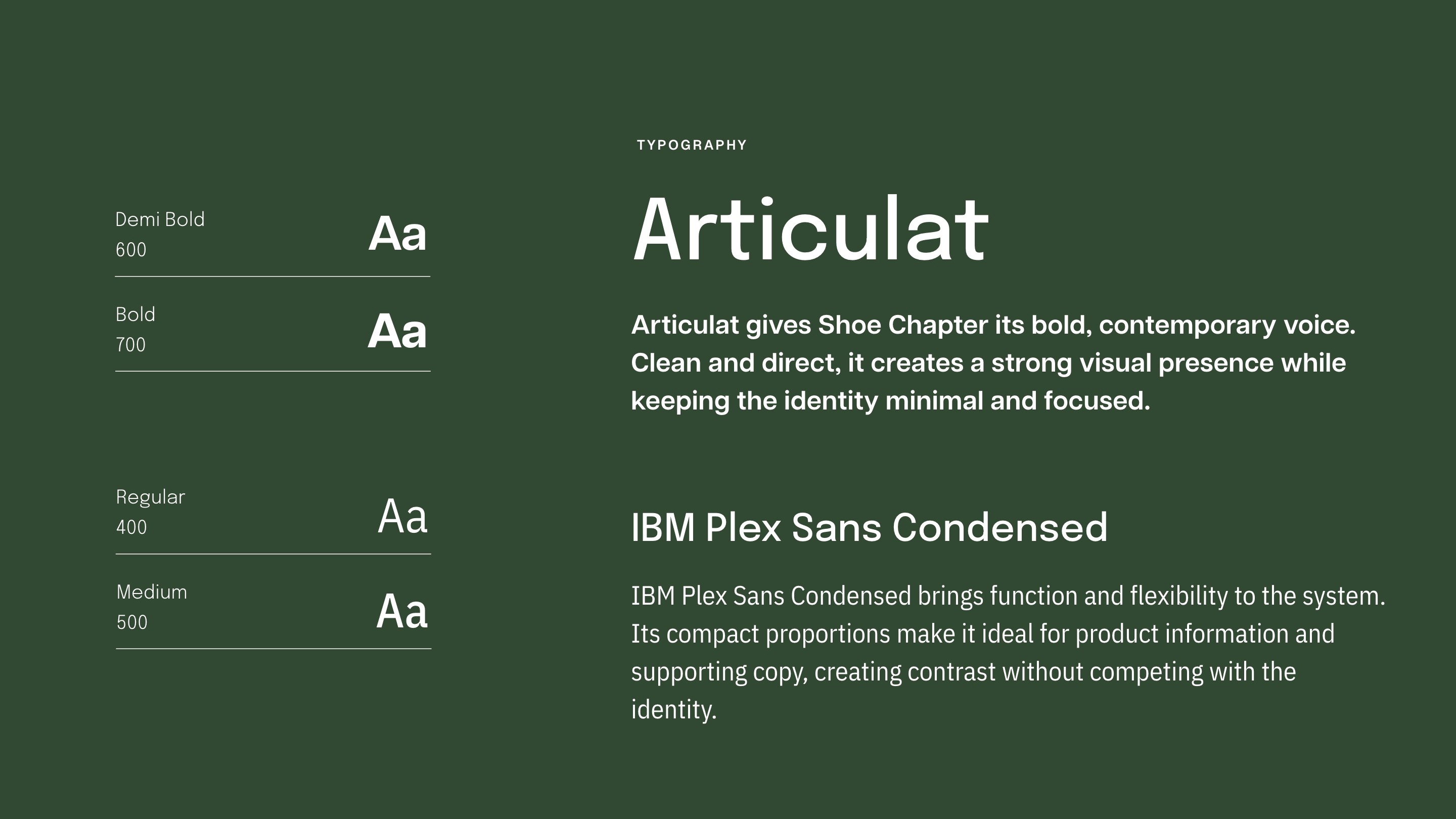
Articulat and IBM Plex Sans Condensed create the supporting typographic system, balancing bold editorial moments with functional product information.
Together, these elements give Shoe Chapter enough personality to feel distinctive while leaving space for the constantly changing products, collaborations and imagery at the centre of the store.

Scope
Brand Identity · Logo Design · Art Direction · Digital Design


